
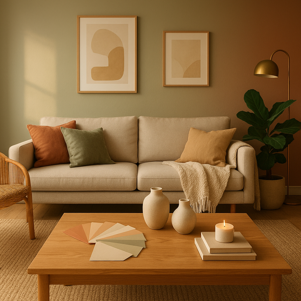
Walk into a room painted deep crimson and your heart rate may subtly quicken. Step into a soft sage green space and your shoulders might drop an inch. These aren’t coincidences — they’re the quiet, consistent effects of colour psychology at work. Most of us choose home colours based on what looks nice in a catalogue, but the science behind those choices runs considerably deeper than aesthetics.
Colour psychology explores how different hues affect human emotion, cognition, and behaviour. In a home environment specifically, where you spend a significant portion of your life, these effects compound over time. The colour on your bedroom wall isn’t just decoration — it’s an active participant in how well you sleep, how stressed you feel, and even how productively you work. Understanding what’s actually happening can transform the way you approach every room in your home.
The Science Behind Colour and Human Perception
When light enters the eye, it doesn’t just register as a visual experience. Photoreceptors in the retina send signals not only to the visual cortex but also to the hypothalamus — the brain region responsible for regulating hormones, body temperature, and emotional responses. This is why colour has measurable physiological effects, not just psychological ones.
Research published in various environmental psychology journals has consistently shown that warm colours (reds, oranges, yellows) tend to increase arousal levels, raise blood pressure slightly, and stimulate appetite. Cool colours (blues, greens, purples) generally have the opposite effect — lowering heart rate, reducing anxiety, and promoting calm. These aren’t universal constants; cultural background, personal associations, and context all play a role. But the baseline biological responses are remarkably consistent across populations.
A study from the University of Texas found that bland, white or grey office environments caused feelings of sadness and depression more frequently in women, while men experienced similar negative effects in purple or orange spaces. Another piece of research from the journal Color Research & Application found that children in blue-painted classrooms showed greater concentration than those in red or yellow rooms. These findings don’t suggest a one-size-fits-all prescription, but they do confirm that colour choices carry real consequence.
Room by Room: What Different Colours Actually Do
The Living Room — Where Social Energy Lives
The living room is typically the social hub of a home, and colour choices here significantly shape how conversations flow and how relaxed guests (and you) feel. Warm neutrals like terracotta, warm beige, or soft ochre create an inviting, energising atmosphere without being overwhelming. These tones subconsciously encourage connection and conversation.
Deep, saturated colours like navy or forest green have surged in interior popularity for good reason — they create a cosy, enveloping quality that feels both sophisticated and psychologically grounding. However, using them on all four walls in a small space can feel oppressive rather than cosy. A common and effective approach is an accent wall paired with lighter complementary tones.
Avoid overly cool, clinical whites in social spaces unless they’re warmed with textiles and lighting. Pure bright white tends to create alertness rather than relaxation, which works against the purpose of a leisure room.
The Bedroom — Psychological Effects of Colour on Rest and Recovery
This is arguably where colour psychology matters most. Sleep quality is deeply tied to your nervous system’s ability to downregulate, and the colours surrounding you during those pre-sleep hours either support or hinder that process.
A widely cited study by Travelodge surveyed over 2,000 British homes and found that people with blue bedrooms averaged the best night’s sleep — approximately 7 hours and 52 minutes per night. Those with purple bedrooms fared worst, averaging just under 6 hours. The researchers attributed this to blue’s ability to lower heart rate and encourage feelings of calm, while purple was found to be mentally stimulating enough to disrupt the wind-down process.
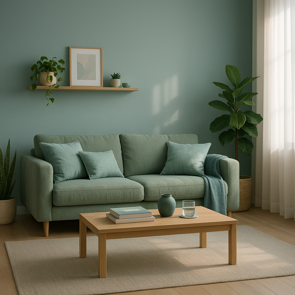
What colour is not ideal for a bedroom? Red is the most consistently cited problematic choice. Its association with urgency, danger, and physical stimulation — all evolutionary responses — makes it counterproductive in a sleep environment. Bright, saturated yellow can also be energising to a fault, increasing anxiety in some individuals when used as a dominant bedroom colour. Similarly, very dark, heavy tones used without balance can create a mood of oppression rather than restful sanctuary.
Soft blues, muted greens, warm lavenders, and gentle neutrals all support the kind of mental stillness that precedes quality sleep. The key is keeping saturation low — deep, rich versions of even “calm” colours can still overstimulate.
The Kitchen — Appetite, Energy, and Stimulation
Yellow kitchens are no accident of trend. Yellow is associated with optimism and mental stimulation, and studies suggest it mildly stimulates the appetite and encourages feelings of sociability. It’s not surprising that yellow has remained a perennial kitchen favourite across decades of changing interior fashions.
Red and orange also stimulate appetite — McDonald’s and countless other food brands have used this knowledge commercially for decades. In a home kitchen, these colours can make the space feel warm and energetic, particularly in north-facing rooms that receive limited natural light. If you’re thinking about how colour and atmosphere work together, creating a warm and welcoming kitchen goes well beyond paint choices alone.
However, if you’re someone who struggles with overeating or finds meal prep stressful rather than enjoyable, a cooler palette of soft greys, pale greens, or crisp whites might be worth considering. These tones create a more focused, less stimulating environment.
The Home Office — Productivity and Mental Clarity
With more people working from home than ever before, the psychology of the home office has become a genuine concern. Green is a particularly well-researched choice for work environments. It’s associated with nature, balance, and creativity, and crucially, it causes less eye fatigue than most other colours during prolonged visual focus — which explains why green has historically been used for reading lamps and card tables.
Blue also performs well in work settings, associated with productivity, trust, and logical thinking. It’s worth noting the difference between a cool, corporate blue and a warmer, softer navy — the former encourages focus, while the latter can feel more reflective and calm, better suited to creative or writing-based work. Pairing the right colours with natural elements is explored further in these biophilic design principles for home offices.
Avoid red in workspaces. Research, including work by psychologist Andrew Elliot, has shown that exposure to red before cognitive tasks actually impairs performance, likely because the colour is so strongly associated with alertness and threat that it activates distraction rather than concentration.
Carl Jung, Kurt Goldstein, and the Theoretical Roots of Colour Psychology
What was Carl Jung’s theory of colour psychology? Jung viewed colour as a language of the unconscious. He believed that different hues corresponded to archetypal energies and emotional states that exist beneath conscious awareness. In his work with patients, Jung encouraged colour-drawing as a therapeutic tool, observing that the colours people were drawn to often reflected their inner psychological states. Red, for Jung, represented vitality and passion; blue, the intellect and spiritual longing; yellow, intuition; and green, the feeling function. While Jung’s framework was interpretive rather than empirical, it laid important groundwork for understanding colour as a psychological rather than purely visual phenomenon.
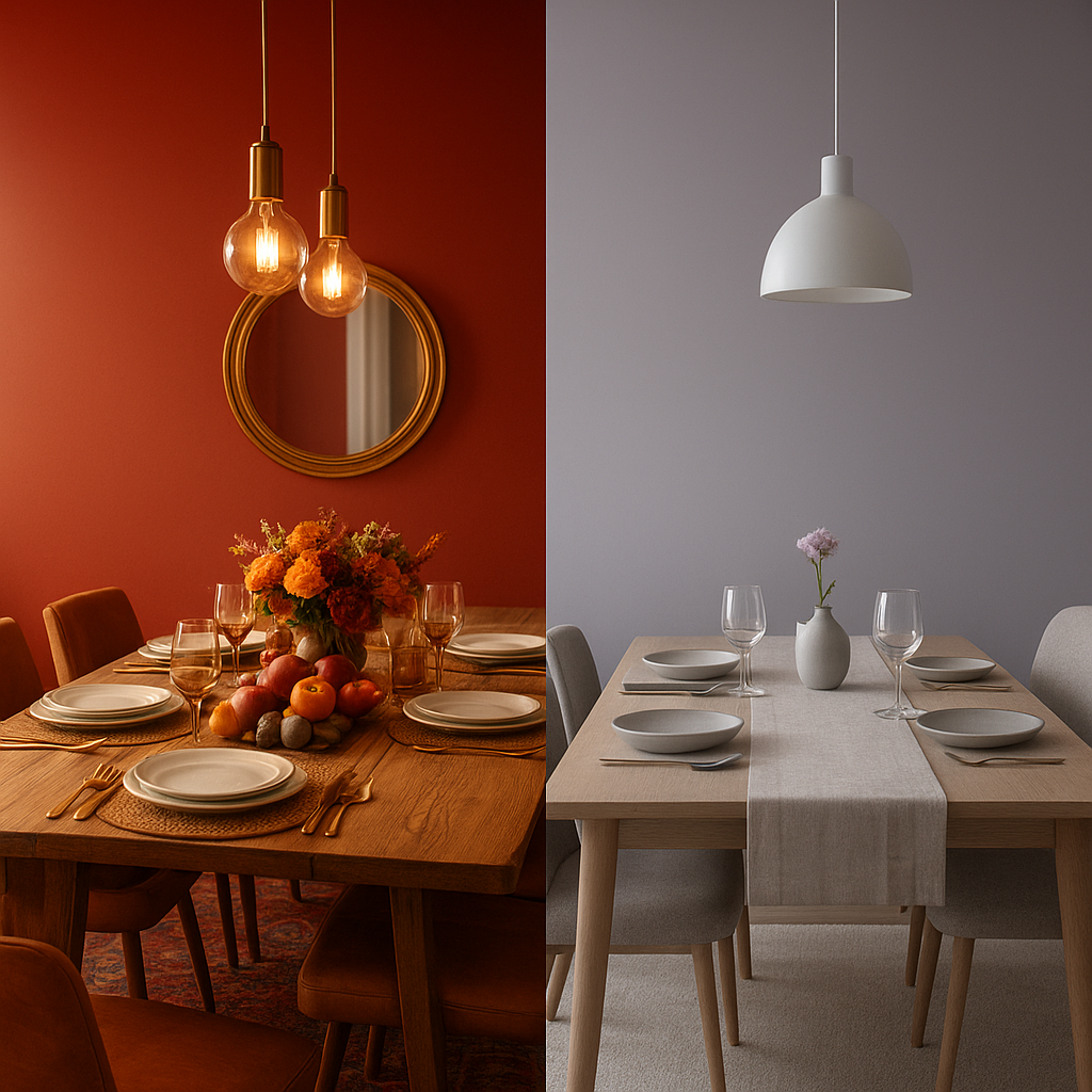
What is Kurt Goldstein’s colour theory? Kurt Goldstein, a neurologist and psychiatrist working in the early 20th century, took a more physiological approach. He observed that patients with cerebellar disorders reacted differently to different colours — red tended to disturb their equilibrium, while green seemed to stabilise it. From this, Goldstein proposed that colours have a direct effect on the entire organism, not merely the visual system. He suggested that warm colours like red and yellow are “expansive” — drawing energy outward and stimulating action — while cool colours like blue and green are “contractive” — drawing energy inward and promoting calm. This distinction between expansive and contractive colours remains influential in how interior designers and environmental psychologists think about spatial colour today.
Why Green Holds a Special Place in Mental Wellbeing
Why is green the colour for mental health? This question has both cultural and biological roots. Biophilia — humanity’s innate connection to the natural world — means that green, as the dominant colour of vegetation and living ecosystems, carries deeply embedded associations with safety, sustenance, and calm. Evolutionary theorists suggest that green environments signalled to early humans that they were in resource-rich, relatively safe territory.
From a neurological standpoint, green requires very little adjustment from the eye to focus on (it falls near the centre of the visible spectrum), meaning it causes less eye strain than other colours. Studies in hospital settings have found that patients recovering in rooms with green elements or views of greenery heal faster and require less pain medication than those in stark, colourless environments.
Mental health organisations have adopted green partly for these associations — it signals growth, renewal, and balance. In home environments, it remains one of the most versatile and psychologically supportive choices available, from the palest mint to a deep, saturated hunter green.
Practical Considerations Before You Repaint
Understanding colour psychology is genuinely useful, but it works best when layered with practical thinking rather than applied rigidly. A few things worth considering before making changes:
- Natural light changes everything. A colour that looks calming in a well-lit showroom can feel gloomy in a north-facing room. Always test paint swatches at different times of day before committing.
- Saturation matters as much as hue. Muted, greyed-down versions of colours tend to be easier to live with long-term and have subtler psychological effects than their bold, saturated counterparts.
- Your personal associations override generalised theory. If blue reminds you of a childhood bedroom you hated, no amount of scientific evidence will make it feel calming to you. Colour psychology describes tendencies, not absolutes.
- Textiles and accessories carry colour psychology too. You don’t always need to repaint. A green velvet sofa, a collection of terracotta cushions, or a bold navy rug can introduce colour psychology principles without permanent commitment.
- Ceiling and floor colours contribute significantly. The fifth wall (ceiling) is often overlooked. A pale blue ceiling mimics sky and increases perceived height; a dark ceiling creates intimacy. These effects are just as real as wall colour.
Bringing It All Together
Colour psychology isn’t interior design mysticism — it’s a well-evidenced field with real implications for how you feel in your home every single day. The colours you live with shape your nervous system’s baseline, influence your sleep quality, affect your appetite, and subtly nudge your mood in directions you may not even consciously notice. That’s a significant amount of influence to leave entirely to chance or trend.
The most empowered approach is an informed one. Understanding that warm tones energise and stimulate while cool tones calm and focus; knowing that saturation level matters as much as the colour itself; recognising that your personal history shapes your individual response — these insights allow you to make choices that serve your actual life rather than just following whatever shade is currently popular on home renovation platforms.
Colour is one of the most accessible tools available for genuinely improving the feel of a home. It requires no structural changes, relatively little expense, and the effects — once you start paying attention — are difficult to ignore.